New book cover for Island of Fog
I've always liked manticores. I once wrote a post about them, aptly titled Manticores, which I urge you to read if you haven't already. Anyway, these mythical creatures have the body of a lion, a semi-human face, and a scorpion's tail.
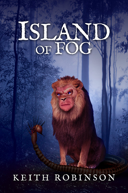
One of the shapeshifters in Island of Fog is a manticore, and I've often thought he would make a good subject for the cover. Back when I started this series, I thought the title and foggy woods alone were atmospheric enough, and that seems to be the case for many older readers, but younger readers in particular are just not interested in it. I found this out when I went to a book signing years ago. So there I was with Book 1, Island of Fog, and Book 2, Labyrinth of Fire, side by side on the table, watching the faces of younger readers as they stopped by. They skipped over the first book and went to the second, drawn to its colorful, vivid dragon cover. Of the two books, they only wanted to buy that one. I had to tell them to ignore the cover, that they really needed to start with the first book in the series. But there was resistance, as if there was no way Island of Fog could be anywhere near as interesting as Labyrinth of Fire.
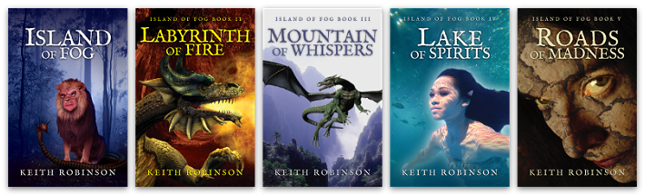
So I've known for a long time that I need to get myself a more interesting cover, one that fits better with the later books, all of which have a subject -- a dragon on Labyrinth of Fire and Mountain of Whispers, a jengu water spirit on Lake of Spirits, and more recently a crazy scrag on the cover of Roads of Madness. In contrast, Island of Fog looks sparse and, frankly, boring.
I'm not a professional cover designer so there are probably many out there who wince when they see my amateur attempts. I'm learning, though, and I hope I'm getting better as time goes on. A little while ago I changed the electronic book covers (Kindle and Nook) so that they had the same style title text throughout, all in capitals to stand out better. But Island of Fog still needs a subject, namely a manticore, hence the purpose of this post.
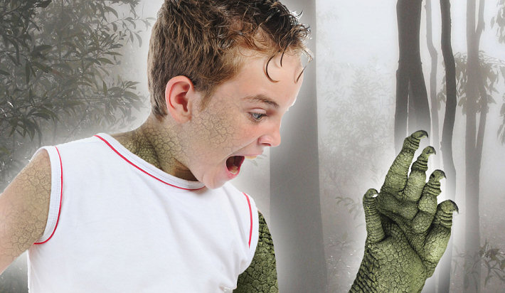
Since manticores are not real, there are no stock photos of them. There are quite a few paintings around, but none that are available to use without infringing on copyright (and probably none that I could afford to buy). So I set about building one. I took a nice stock photo of a lion (which I bought for a few dollars) and then a few extra photos of "components" with which to transform the lion into a manticore.

larger view
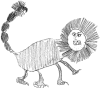
I tried a number of different faces but kept coming back to the one pictured here in the final cover. He looks dangerous yet calm and intelligent at the same time, capable of dialog. Some artists depict manticores as wild beasts, but I like to think of them as smart as well as dangerous. And the one in Island of Fog is, after all, one of the shapeshifters. Hal, Robbie and Abigail confront him in Black Woods, and this becomes a pivotal moment for the friends as they fully realize their own shapeshifting talents...
My covers always have a slightly surreal quality to them because they're constructed with photos rather than paintings. I'm okay with that. If I could just visit a mythological zoo and take a couple of photos of a manticore, it would be SO much easier.
This particular version of the cover was "approved" by a class of fifth-grade students in author Brian Clopper's class. I had another version with his mouth open, but he looked more like a gorilla (not surprisingly, since I used a picture of King Kong's mouth). And another version that looked... well, odd. That was using a picture of Michael Myers' mask from the Halloween movies.
Anyway, I'm probably going to introduce this new cover to the electronic books within the next week:
Assuming there's no "Arrghh!! No!! It's horrible!!" outcry, the new cover will also show up on the print editions eventually, but that's another matter. Out of consideration for those who have collected the set so far, I don't want to change the cover format too much. So when it comes to the print editions, the title text throughout the series will remain the same as it is right now. Only the picture on Island of Fog will change, and that might take a while because of the way print publishing works.
In a separate post I'll give you an overview of all the different covers I've either used or abandoned throughout this series. Some you've seen and some you haven't. It should be fun! In the meantime, I'll leave you with this cheesy yet "says-it-all" design that I'll be using on a t-shirt at Dragon*Con next month...
Love it! Love the new fonts and the homogeneous look. One suggestion: Add Island of Fog Book 1 to the first book cover. Even if you feel you might put off first time buyers into thinking they might have to buy a series, I feel the idea of a series is more appealing for a majority of readers. Also love hal-claw.jpg! Awesome. I think a suite of images like this added to the books (digital only?) would add something worthwhile. I always loved the illustrations in Famous Five.
Now that you mention it, I had considered adding "Book 1" or something to the top of Island of Fog. It makes sense. The only reason I didn't before was because it would look strange saying "Island of Fog Book 1: Island of Fog" — a bit repetitive. Or does that matter? Alternatively it could say "The first book in the series" or something similar, but it would certainly follow through better with "Island of Fog Book 1." Yes, I should do that.
And adding Hal's claw somewhere would be great. I could even put it on the back cover of the printed book. Ha! I like the idea of adding "illustrations" too, photos or otherwise, but to make it worthwhile I'd have to add at least six per book — and that's a lot of work right there. I'm interested in doing it, but time is the issue. *grimace*
Actually, I like the books better without illustrations. That way everybody can have their own imaginings!
How about a competition to add pictures from fans/classrooms?
Would you like me to cross-post to your FB page?
Mm, yes, Heather, maybe you're right. Illustrations are a matter of taste. If they're completely different to what the reader imagines, they can spoil things somewhat. I would say that surely the Author's Word is a good thing, but sometimes even that's not the case. I'll never forget hearing the great fantasy author Terry Brooks speaking at last year's Dragon*Con and pronouncing his own famous Shannara series "incorrectly" (at least according to most fans in the room).
Brian, I could do such a competition, maybe for a collection of images on my new Pinterest page, but honestly it would have to be limited to budding artists, hehe. And even then, their imagination is going to differ from mine (and obviously everyone else's).
Feel free to link to Facebook! I already did, but the more shares the better. :-)
Show/hide all posts
- Box of Fables (Island of Fog Book 16) is finished! How would you like to read it earlier than everyone else?
- How to find the best keywords for Amazon (AMS) sponsored ads
- Next Chapter Con - A Books and Authors Convention
- The best laid plans of mice and men... and overworked writers who bite off more than they can chew
- Look out for at least 3 new books coming in 2019
- Book cover, title, and blurb - how did I get it so wrong?
- A cat named Frosty, a new book convention, and unicorns
- Fantasy and sci-fi cons and other author events
- Sci-fi episodic serial fiction - free for KU Kindle Unlimited readers
- How I'm going to publish 15 books in seven months
- Post a review for Island of Fog Box Set 1-3 and help make the next Box Set free!
- Doctor Who, anyone?
- Death Storm (Island of Fog Legacies #5) is published!
- A mild obsession with talking dragons in my fantasy books
- Middle-grade fantasy books with an Island of Fog theme
- Finding mythical monsters to put in my books
- Working hard to hardly work
- Island of Fog Box Sets now available... and FREE on Kindle Unlimited
- Get ready for a World of Fog
- Exactly how many times does an author edit and proofread a novel before publishing?
- New book hurtles toward publication
- Female fauns and other imponderables
- Save 20% on Island of Fog titles for a limited time
- A faun with a mist-erious power
- Think your book doesn't need proofreading? Think again!
- Results of BookBub promo for Sleep Writer (Book 1)
- Warp Giants (Sleep Writer Book 4) is published!
- A book is finished, and a new one starts!
- Con Nooga... and reactions to my book selling techniques
- Goodbye 2017, Hello 2018
- Tails of a Shapeshifter is published!
- Sleep Writer series has a brand new set of covers
- Constructing, websiting, and writing all at once
- Haunted Fortress (Island of Fog Legacies #4) is published!
- Completed book, forthcoming books, audiobooks, book sales, book covers, and... darkness!
- Book 4 of the Island of Fog Legacies just about finished
- Cover art, movie theaters, lazy writing, clunky first chapters, and being incredibly successful
- Novel proofreading service
- Gargoyle Scourge (Island of Fog Legacies #3) is published!
- Gargoyle Scourge available from bookstores on March 1st, 2017
- Island of Fog translated into Spanish!
- Gargoyle Scourge is ready for beta reading
- Happy holidays, massive downloads, foggy plans, black comedies, and daft ideas
- Gargoyles, a classroom in Australia, book reviews, and my kitchen floor
- Working on a new book cover for Sleep Writer
- When is it okay to give away major plot details?
- Latest book, website changes, marketing, and freebies!
- What's a self-published indie novel really worth?
- Sinister Roots (Island of Fog Legacies #2) is published!
- Sinister Roots launches in 9 days... and Unicorn Hunters is on sale!
- Plotting the next book
- Sinister Roots is finished!
- Back from vacation, and hardly a word written!
- Writer's block, stalling, and just plain old procrastination
- How do most readers find good new books to read?
- On the lookout for repeated words in manuscripts
- Free short story The Silver Wand (Part 4 of 4) now available
- Introducing the next book in the Island of Fog Legacies series
- Answers to a few niggles
- Unicorn Hunters (Island of Fog Legacies #1) is published and available everywhere!
- Free short story The Silver Wand (Part 3 of 4) now available
- Using a Chromebook for novel writing and editing
- Early reviews for Unicorn Hunters
- Pre-order Unicorn Hunters and get it on March 15th 2016
- Free short story The Silver Wand (Part 2 of 4) now available
- Unicorn Hunters first draft finished!
- Free short story The Silver Wand (Part 1 of 4) now available
- Sleep Writer series now available in paperback!
- New cover for new book in new Island of Fog series!
- Just over a million words
- Free short story Be Good for Belsnickel now available
- My name is Keith Robinson and I'm a writer
- Free short story The Soothsayer now available
- Mountain of Whispers Audiobook now available!
- Help make a book permafree... and then get it for free!
- Caleb's World (Sleep Writer Book 3) is published
- Another book just about ready to publish
- Free short story Trading Magic now available
- Free short story Unicorn Poachers now available
- Caleb's World undergoing final edits
- Free short story Robbie and the Ogres now available
- Monsters in the Fog is published!
- The second Island of Fog Chronicles book due for release on August 1st
- Free short story Riding the Serpent now available
- Robot Blood (Sleep Writer Book 2) is published
- Labyrinth of Fire Audiobook now available!
- Robot Blood is finished!
- Free short story Darcy the Dryad now available
- Robot Blood nearing completion and on schedule for June release
- Free short story Bird-Girl and the Shaggy Beast now available
- The price of Island of Fog novellas
- Free short story Night of the Centaur now available
- Free short story Nameless Monster is available today
- Island of Fog Audiobook published!
- Plans to continue the Island of Fog series
- Get a free cartoon of your child or other small person as a superhero monster!
- Eye of the Manticore and Wings of a Faerie are published!
- Countdown to February 15th
- Unearthed (Fractured Book 2) is published!
- Lots of fog planned for 2015
- Eye of the Manticore is finished and in final editing stage
- Island of Fog audiobook planned for release in the spring
- Island of Fog as an audiobook?
- A Very Merry Shapeshifting Christmas
- What's happening over Christmas and into the New Year
- Unearthed (Fractured Book 2) is ready for beta readers
- Island of Fog Chronicles coming in the New Year
- Island of Fog Omnibus Edition (Books 1-3)
- Fractured Book 2 is full steam ahead
- Sleep Writer (Book 1) is published!
- New series about to be launched
- Castle of Spells (Island of Fog, Book 9) is published!
- Possible reworking of Island of Fog
- Prison of Despair (Island of Fog, Book 8) is published!
- Castle of Spells on the horizon
- Prison of Despair beta readers!
- Last day of April
- Coming up in 2014
- The timeline in a long-running series
- What future Island of Fog tales would YOU like to see?
- My new writing regime
- Island of Fog Book 9: Castle of Spells
- Island of Fog Book 8: Prison of Despair
- Quincy's Curse is published!
- What's going on (and not)
- Valley of Monsters (Island of Fog, Book 7) is published!
- How to provide a reader with recaps of previous books in a series
- Valley of Monsters is now out to beta readers
- Are you interested in beta-reading Valley of Monsters?
- A series of Unearthly Tales starting in 2014
- Quincy's Curse out for beta reading
- FRACTURED is published and available!
- Progress on Valley of Monsters and beyond
- Books I'll be publishing in the next few months
- Island of Fog Book 7: Valley of Monsters
- Advertising and promoting an ebook with BookBub
- Sci-fi and fantasy novel Fractured is ready for beta reading
- Going perma-free on Amazon
- All books in the Island of Fog fantasy series now available at Amazon, Kobo, iBookstore, and Barnes & Noble
- Finding beta readers and proofreaders for your self-published indie novel
- Writing and editing a sci-fi/fantasy novel with another author
- Island of Fog is a B.R.A.G. Medallion Honoree
- Ned Firebreak by Brian Clopper
- The cost of shipping books internationally
- Chamber of Ghosts is published
- Island of Fog Book 7 - including prequel!
- Pre-order Chamber of Ghosts
- Movie adaptation of Island of Fog for release in 2015 (April Fool's)
- Island of Fog featured as Book of the Month
- Letters and artwork from a classroom in North Carolina
- Calling for Chamber of Ghosts beta readers
- Late edits to Chamber of Ghosts
- Website overhaul
- The ISLAND OF FOG fantasy series
- Collaborative novel writing
- Fractured - a free sci-fi and fantasy novel
- First draft of Chamber of Ghosts is finished
- Dragon book series
- Four FREE Kindle books for Christmas
- Piers Anthony reviews Roads of Madness
- Writing schedule
- How to design a book cover
- Island of Fog Book 6 - Chamber of Ghosts
- Free Kindle books for Halloween
- Island of Fog Book 6
- KDP Select aftermath
- In the works for 2012 and 2013
- Searching for young-adult and middle-grade fantasy books on Kindle
- Roads of Madness is available in print
- Does KDP Select work?
- Roads of Madness is available on Kindle
- Island of Fog is FREE for Kindle on August 29th-30th
- Brand new Island of Fog web page
- New book cover for Island of Fog
- Advanced reader copies of Roads of Madness nearly ready
- Flight of Blue
- Irving Wishbutton and the Questing Academy
- Get an advance copy of Roads of Madness
- Roads of Madness preview and launch date
- Ideas to reboot the Island of Fog series
- Price change for Kindle and Nook ebooks
- Letters and artwork from fifth-grade students
- Summer Reading Kick-off - winner of Island of Fog series
- The power of a printed book
- Author Keith Robinson's Fantasy Novels Make Front Page With Chickamauga Library Book Signing
- How NOT to promote your self-published novel
- Book signing at Chickamauga Library on April 10th
- Roads of Madness on Twitter and Facebook
- Do you like cliffhangers in novels?
- Island of Fog Book 5: Roads of Madness
- Brian Clopper: writer, teacher and foot soldier
- Quincy's Curse and Caleb's World
- What does 2012 have in store?
- On the subject of Santa Claus
- Lake of Spirits review by Piers Anthony
- Stop typing for a second, please!
- Where did Miss Simone come from?
- Are prologues necessary?
- Lake of Spirits now available in print
- Dragon*Con 2011
- Lake of Spirits available on Kindle and Nook
- Third Writers' Platform-Building Campaign
- Lake of Spirits proofreading and editing is finished!
- Reviews and featured spots for Island of Fog series
- Why I write a chapter summary for the next book
- What blog posts do you like and dislike?
- Creepy and not great for impressionable children
- Lake of Spirits is being proofread
- Thinking about Island of Fog: Book 5
- On the search for a literary agent
- How many self-published books sold to date
- Lake of Spirits first draft is FINISHED!
- The second trilogy
- Progress in the lake
- The benefits of self-publishing and ebooks
- Millions of books sold at Barnes & Noble
- Book signing at Barnes & Noble, Chattanooga, TN
- Letters from Jones Dairy Elementary School Part II
- The science of fantasy creatures
- The phoenix arises
- Island of Fog Book IV: Lake of Spirits
- The Impossible World
- Preparing for the storm
- A new year and a new novel
- Question Time: Part 2
- NaNoWriMo 2010 Winner
- Publisher says no
- NaNoWriMo update
- NaNoWriMo 2010
- Books Never-Ending
- On the shelf at Barnes & Noble
- School blog
- Question Time: Part 1
- Dragon*Con in Atlanta, Georgia
- On TV again... or was I?
- Author copyright
- Busy day at the office
- Mountain of Whispers is PUBLISHED!
- Mountain of Whispers is FINISHED!
- Minichapters
- Mountain of Whispers final book cover!
- Mountain of Whispers cover update
- Books can be ordered at Barnes & Noble
- You can't rush a genius...
- Look, I can't help being British
- Cherokee Regional Summer Reading Kickoff 2010
- Readability test
- Review by Publishers Weekly
- Mountain of Whispers first draft completed
- Farewell to ABNA
- Naga mythology... and Medusa
- Abigail doesn't sing!
- ABNA expert reviewers
- The ABNA quarterfinalist results are in!
- Writer's Digest International Self-Published Book Awards
- Letters from Jones Dairy Elementary School
- ABNA first round winning pitch
- A third of the way through Mountain of Whispers
- New shipping rates
- Manticores
- ABNA pitch
- Piers Anthony and Amazon Breakthrough Novel Award
- Book Talk at Rossville Library
- Quality control at CreateSpace
- Mountain of Whispers
- Book III: The plot thickens
- Expanded Distribution at CreateSpace
- Self-publishing
- Book delivery... and new book trailer
- Replacement order, watery events, and ideas for book title
- Box of books missing... or lost?
- Book Nook in Dalton
- Book review winner... and Happy Thanksgiving!
- Book signings and events galore
- Labyrinth of Fire available for pre-order
- Grammar, and other pointless trivia
- Library visit, events, agents, editing, and reviews!
- Teen Read Week at Chickamauga Library
- Georgia Literary Festival 2009
- Book cover comparison
- New dragonized book cover
- Win a copy of Labyrinth of Fire by reviewing Island of Fog
- 104,227
- Final chapters of Labyrinth of Fire
- Lava tubes and dragons
- Male harpies
- Impromptu talk and book signing at Rossville Middle School
- Three library book talks finished
- Treatments and manuscripts
- Ray Atkins book talk and signing
- The Bookshelf interview on UCTV-3
- TV and film agent for Island of Fog
- TV interview and appearances
- Island of Fog now on Kindle
- Tweeting and writing
- Gumberoos and squonks
- Labyrinth of Fire
- First public speaking
- Thumbs up from Piers Anthony
- Down Home Days
- First delivery of books
- Island of Fog now published and available to buy!
- PDF download now available
- Proof book has arrived
- Island of Fog is published!
- Final, final, FINAL edit
- The manuscript is back!
- Sending Island of Fog to an editor
- Self-Publishing vs. Traditional Publishing
- Writing, writing, writing
- Feeling an urge to write