How to design a book cover
Just to be clear, this post is about how I design and create my own book covers and is NOT necessarily a lesson in what designs work best and market well. I'm not a marketing expert, just a computer geek. I'm assuming that you have a good graphics program and have some basic knowledge of resolution.
Design your cover at high resolution
I can't stress this enough. Even if you're only planning to sell your book in electronic form (Kindle, Nook, etc), I would strongly advise you to build a high-resolution, print-ready cover. An ebook cover is seen only on a computer screen and is a relatively small image, whereas a paperback book cover is printed and needs to be a much higher resolution (about three or four times bigger than your ebook cover). It's very easy to copy and downsize a cover for use with your ebook, but not the other way around. If you make the mistake of building your cover at ebook size, then decide later you want to print the book as well, you'll have to start over. You can't -- repeat can't -- just enlarge your ebook cover for printing. It will look awful.
Choose a book size and create your working canvas
As a quick guide, and using CreateSpace as our (future) paperbook book printing service, decide what book size you want to use. Two popular choices are 6 x 9" and 5.25" x 8" and whichever size you pick will determine your starting point when creating your canvas. You need to allow "bleed" on a printed book cover, which is where your cover extends slightly beyond the finished size. This is to allow for the tiniest of inaccuracies when the cover is printed and cropped for binding. CreateSpace require that you allow 0.125" on each side. So:
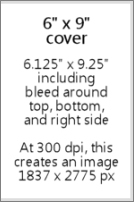
- A book cover with a height of 9" will become 9.25" (0.125" + 9" + 0.125").
However, since your cover will normally wrap around the book, there's no need to leave a bleed on the left side because it won't actually be cut there. So:
- A book cover with a width of 6" will become 6.125" (6" + 0.125" bleed).
Clear? We won't go into spines and back covers here. The back cover would of course be the same dimensions, but the spine width depends on the number of pages in your book. If you want to calculate this and a build a complete wraparound cover, use this handy CreateSpace information.
Anyway, you now have a cover size of 6.125" wide x 9.25" high. If you want a different book cover size, you can figure it out using the same formula because the bleed is the same no matter what.
If you go ahead and create a new canvas in your graphics program with the above dimensions, and with the resolution set to 300 dpi, you should find that this equates to about 1837 x 2775 pixels. I'll be using pixel sizes from now on in this post because everything on the internet and on your screen uses pixel dimensions.
Plan your cover layout and allow space for the title and author name
A common mistake I've heard about is finding the "perfect" image for your cover and then finding that there's no good place to put the title and author name -- or adding the title and author name over the top anyway and finding that it's all a little busy and unclear. When looking for your cover image, you need to plan ahead and visualize the text that will go with it.
Normally a printed book cover and an ebook cover will be the same (with a difference in overall size and perhaps a slight variation in ratio). But there's one important thing to remember about your cover, especially with ebooks: when promoting your book on the internet, it will initially be seen by potential readers as a tiny thumbnail. It's worth considering that your title and author name are big and bold enough to be read at such a small size, and your image should ideally be fairly clear and not too busy. Look at this random mix and see which ones work:
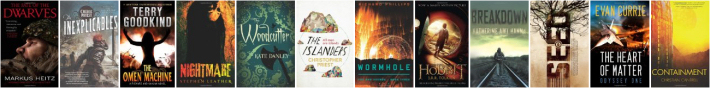
Thumbnails on Amazon and Goodreads are usually bigger than this when you're browsing their categories, but there are plenty of places where your cover will be tiny, for example on the "Customers Also Bought..." feature on Amazon. There's no harm in giving it some thought at least.
Finding and editing your cover image
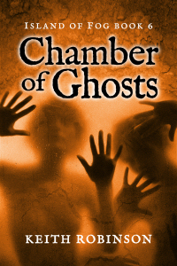
There are a billion alternative ways you can put your cover together. All I can do here is give you a hint about the steps I went through to design Chamber of Ghosts. I started off with a general idea of what I wanted, and went to a couple of royalty-free stock-image websites like BigStockPhotos.com and 123RF. Images only cost a few dollars each and are well worth having. Don't even think about using one from Google's image library. If you're going to spend any money, spend a few dollars on a good high-resolution image that you know you're allowed to use.

Here's the one I bought shown with the book cover guide outline. Remember the book cover size I mentioned above? Bear that in mind when you buy your image. It will probably come in different sizes, and you DON'T want to enlarge it after you've bought it. Make sure to pick one that is big enough to use. Downsizing is fine and most likely necessary.
The one I bought was 3831 x 2554 pixels and I knew that, once cropped to fit a portrait-orientation book cover, I would need to add a bit to the top. I could have bought a bigger image to fit the full height, but I didn't want the title text running over the ghostly faces. Best to leave some clean, empty space for that.
Then the fun started. This is where spent a few hours editing. I adjusted its color, brightness and contrast. Then I added a layer image of solid rock and deleted the bit in the center (with some heavy feathering all around) so that the main image showed through. This started to give it the effect that these ghosts are in fact within/behind a solid rock wall. I then added some smaller details like a crack across the front, a bit more feathered rock here and there, and some "noise" to the whole thing to give it a more grainy effect. Basically I messed with it until I was happy. A final touch was darkening the top corners.

All this gave me a bright, vibrant image but with a big, clear space for the title text.
Adding your title and author text
Don't use standard computer fonts. I did this on the first three books in the series and have regretted it ever since. Fonts that are too "familiar" scream amateur. Go and find yourself a really nice rare, stylish, but clear font. There are plenty of free font sites including Google web fonts.
I made my text nice and big. Normally on a dark background I would use light-colored text with black drop-shadow to make it stand out, but in this case I used black with a white glow. It's more ghost-like.
Remember that little extra bleed to the right edge of the canvas? I used to debate over whether to center my text INSIDE the bleed or go all the way to the outside edge. Honestly, it doesn't seem to matter one way or another. When producing book cover images for use on the internet, then I make sure it's centered. But for your print copy, you can't control it as much as you'd like. The cover is cut where it's cut, and it wraps around the spine imperfectly, so your text will never be absolutely centered whatever you do. But it's usually close enough.
Create your ebook cover
Finally, the last piece of the puzzle. This is the fun and easy part. Just downsize the entire thing. But to what size, I hear you ask? Well, I have multiple images for different reasons. A bigger question is not the size but the proportion of the image you use for your ebook. Many say that ebook covers should perfectly fit the screen of a Kindle or Nook, and for that your image will need to be a little more square...

Something like 600 x 800 should work -- or 800 x 1066, which is the same ratio but (apparently) the "perfect" resolution to fill most device screens. Personally, I still use the printed book proportions so my covers are slightly slimmer/taller. Just look around on Amazon and see which you prefer. Look on your Kindle and see how those fill the screen -- or not.
At the end of the day, readers really just want to read the book and probably won't care if the cover fills the screen or not. Even big-name authors, backed by giant publishing houses, vary on this subject; there seems to be no set-in-stone standard. So don't lose too much sleep over it.
Lovely. I do appreciate this behind-the-scenes look. This cover is so eye catching and I like the orange overall hue. Do you consciously think of overall color when you do a book in your series?
That was so cool! I wish I had even half your talent! LOVE the new book cover!
MTLBYAKY
Jana~
Thank you, both! Brian, I often have a color in mind, something that's different to the other books in the series. In this case that color changed from green to a silvery-grey and then to the orange! — but I was still consciously trying to avoid a similar coloring to previous books.
Jana, don't you wish you had ALL my talent, not just half? Hehe. :-)
Very thorough and helpful. This is one of those posts that will end up getting bookmarked quite a bit, I suspect. Thanks Keith!
Glad you liked, Roger. Sometimes I write posts purely for the purpose of making them "sticky" for those who are interested in such things. In fact, the title "How to design a book cover" forms a url filename "how-to-design-a-book-cover," which is keyword-rich and will likely match a search for those who are seeking answers — or will eventually, anyway, once it gets indexed. :-)
This information is really very useful. I really appreciate you’ve shared this information. Thanks a lot for sharing. Great posting!
This is really insightful. The information shared will surely help us come up with a great book cover. I am glad you shared this info. Thanks a lot for sharing.
This is very, very helpful. I've been wondering if it mattered whether it was centered perfectly, or if I should make print covers deliberately off-centre to accomodate the no-bleed at the spine. Glad to know it doesn't matter. :-)
What I don't get is how one assures clear, sharp text on the back cover with a nice smooth picture on the front. I need to know techie things like what software to use (I have Paint Shop Pro X8, Acrobat, and Word 2016). But I have not been able so far to create the back and front covers that look good on a printed book.
Hmm, I feel another post coming on! The main thing, though, is the overall dimensions of the wraparound printable cover. It has to be huge, at least 300 dpi. I'll work on a post sometime soon to explain what I do, but in the meantime, if you need help, I'm happy to give some personal instruction at a reasonable cost. Email me! By the way, I use Paint Shop Pro as well.
What dimensions would you recommend using to create a trilogy book cover?
Thanks
Victoria, I'm not sure what to tell you. A trilogy book cover? That's a standard cover for three different books, right? Or do you mean an omnibus edition where all three books are included in one? If so, it's still the same as a standard cover, just with a thicker spine. Or it could be bigger than normal to allow for more text on the page and therefore fewer pages...
Hi Keith,
Just had a quick question. I'm using Createspace for my paperback book and I downloaded the template for the size I want. I put my cover that I already had created over the template correctly, but Createspace emailed and said there's no bleed room. So, do I want to make my front and back covers slightly bigger than the template to give room for bleed?
Thanks,
K.R.
Hmm. Could you email me the cover so I can see? keith@unearthlytales.com
Show/hide all posts
- Box of Fables (Island of Fog Book 16) is finished! How would you like to read it earlier than everyone else?
- How to find the best keywords for Amazon (AMS) sponsored ads
- Next Chapter Con - A Books and Authors Convention
- The best laid plans of mice and men... and overworked writers who bite off more than they can chew
- Look out for at least 3 new books coming in 2019
- Book cover, title, and blurb - how did I get it so wrong?
- A cat named Frosty, a new book convention, and unicorns
- Fantasy and sci-fi cons and other author events
- Sci-fi episodic serial fiction - free for KU Kindle Unlimited readers
- How I'm going to publish 15 books in seven months
- Post a review for Island of Fog Box Set 1-3 and help make the next Box Set free!
- Doctor Who, anyone?
- Death Storm (Island of Fog Legacies #5) is published!
- A mild obsession with talking dragons in my fantasy books
- Middle-grade fantasy books with an Island of Fog theme
- Finding mythical monsters to put in my books
- Working hard to hardly work
- Island of Fog Box Sets now available... and FREE on Kindle Unlimited
- Get ready for a World of Fog
- Exactly how many times does an author edit and proofread a novel before publishing?
- New book hurtles toward publication
- Female fauns and other imponderables
- Save 20% on Island of Fog titles for a limited time
- A faun with a mist-erious power
- Think your book doesn't need proofreading? Think again!
- Results of BookBub promo for Sleep Writer (Book 1)
- Warp Giants (Sleep Writer Book 4) is published!
- A book is finished, and a new one starts!
- Con Nooga... and reactions to my book selling techniques
- Goodbye 2017, Hello 2018
- Tails of a Shapeshifter is published!
- Sleep Writer series has a brand new set of covers
- Constructing, websiting, and writing all at once
- Haunted Fortress (Island of Fog Legacies #4) is published!
- Completed book, forthcoming books, audiobooks, book sales, book covers, and... darkness!
- Book 4 of the Island of Fog Legacies just about finished
- Cover art, movie theaters, lazy writing, clunky first chapters, and being incredibly successful
- Novel proofreading service
- Gargoyle Scourge (Island of Fog Legacies #3) is published!
- Gargoyle Scourge available from bookstores on March 1st, 2017
- Island of Fog translated into Spanish!
- Gargoyle Scourge is ready for beta reading
- Happy holidays, massive downloads, foggy plans, black comedies, and daft ideas
- Gargoyles, a classroom in Australia, book reviews, and my kitchen floor
- Working on a new book cover for Sleep Writer
- When is it okay to give away major plot details?
- Latest book, website changes, marketing, and freebies!
- What's a self-published indie novel really worth?
- Sinister Roots (Island of Fog Legacies #2) is published!
- Sinister Roots launches in 9 days... and Unicorn Hunters is on sale!
- Plotting the next book
- Sinister Roots is finished!
- Back from vacation, and hardly a word written!
- Writer's block, stalling, and just plain old procrastination
- How do most readers find good new books to read?
- On the lookout for repeated words in manuscripts
- Free short story The Silver Wand (Part 4 of 4) now available
- Introducing the next book in the Island of Fog Legacies series
- Answers to a few niggles
- Unicorn Hunters (Island of Fog Legacies #1) is published and available everywhere!
- Free short story The Silver Wand (Part 3 of 4) now available
- Using a Chromebook for novel writing and editing
- Early reviews for Unicorn Hunters
- Pre-order Unicorn Hunters and get it on March 15th 2016
- Free short story The Silver Wand (Part 2 of 4) now available
- Unicorn Hunters first draft finished!
- Free short story The Silver Wand (Part 1 of 4) now available
- Sleep Writer series now available in paperback!
- New cover for new book in new Island of Fog series!
- Just over a million words
- Free short story Be Good for Belsnickel now available
- My name is Keith Robinson and I'm a writer
- Free short story The Soothsayer now available
- Mountain of Whispers Audiobook now available!
- Help make a book permafree... and then get it for free!
- Caleb's World (Sleep Writer Book 3) is published
- Another book just about ready to publish
- Free short story Trading Magic now available
- Free short story Unicorn Poachers now available
- Caleb's World undergoing final edits
- Free short story Robbie and the Ogres now available
- Monsters in the Fog is published!
- The second Island of Fog Chronicles book due for release on August 1st
- Free short story Riding the Serpent now available
- Robot Blood (Sleep Writer Book 2) is published
- Labyrinth of Fire Audiobook now available!
- Robot Blood is finished!
- Free short story Darcy the Dryad now available
- Robot Blood nearing completion and on schedule for June release
- Free short story Bird-Girl and the Shaggy Beast now available
- The price of Island of Fog novellas
- Free short story Night of the Centaur now available
- Free short story Nameless Monster is available today
- Island of Fog Audiobook published!
- Plans to continue the Island of Fog series
- Get a free cartoon of your child or other small person as a superhero monster!
- Eye of the Manticore and Wings of a Faerie are published!
- Countdown to February 15th
- Unearthed (Fractured Book 2) is published!
- Lots of fog planned for 2015
- Eye of the Manticore is finished and in final editing stage
- Island of Fog audiobook planned for release in the spring
- Island of Fog as an audiobook?
- A Very Merry Shapeshifting Christmas
- What's happening over Christmas and into the New Year
- Unearthed (Fractured Book 2) is ready for beta readers
- Island of Fog Chronicles coming in the New Year
- Island of Fog Omnibus Edition (Books 1-3)
- Fractured Book 2 is full steam ahead
- Sleep Writer (Book 1) is published!
- New series about to be launched
- Castle of Spells (Island of Fog, Book 9) is published!
- Possible reworking of Island of Fog
- Prison of Despair (Island of Fog, Book 8) is published!
- Castle of Spells on the horizon
- Prison of Despair beta readers!
- Last day of April
- Coming up in 2014
- The timeline in a long-running series
- What future Island of Fog tales would YOU like to see?
- My new writing regime
- Island of Fog Book 9: Castle of Spells
- Island of Fog Book 8: Prison of Despair
- Quincy's Curse is published!
- What's going on (and not)
- Valley of Monsters (Island of Fog, Book 7) is published!
- How to provide a reader with recaps of previous books in a series
- Valley of Monsters is now out to beta readers
- Are you interested in beta-reading Valley of Monsters?
- A series of Unearthly Tales starting in 2014
- Quincy's Curse out for beta reading
- FRACTURED is published and available!
- Progress on Valley of Monsters and beyond
- Books I'll be publishing in the next few months
- Island of Fog Book 7: Valley of Monsters
- Advertising and promoting an ebook with BookBub
- Sci-fi and fantasy novel Fractured is ready for beta reading
- Going perma-free on Amazon
- All books in the Island of Fog fantasy series now available at Amazon, Kobo, iBookstore, and Barnes & Noble
- Finding beta readers and proofreaders for your self-published indie novel
- Writing and editing a sci-fi/fantasy novel with another author
- Island of Fog is a B.R.A.G. Medallion Honoree
- Ned Firebreak by Brian Clopper
- The cost of shipping books internationally
- Chamber of Ghosts is published
- Island of Fog Book 7 - including prequel!
- Pre-order Chamber of Ghosts
- Movie adaptation of Island of Fog for release in 2015 (April Fool's)
- Island of Fog featured as Book of the Month
- Letters and artwork from a classroom in North Carolina
- Calling for Chamber of Ghosts beta readers
- Late edits to Chamber of Ghosts
- Website overhaul
- The ISLAND OF FOG fantasy series
- Collaborative novel writing
- Fractured - a free sci-fi and fantasy novel
- First draft of Chamber of Ghosts is finished
- Dragon book series
- Four FREE Kindle books for Christmas
- Piers Anthony reviews Roads of Madness
- Writing schedule
- How to design a book cover
- Island of Fog Book 6 - Chamber of Ghosts
- Free Kindle books for Halloween
- Island of Fog Book 6
- KDP Select aftermath
- In the works for 2012 and 2013
- Searching for young-adult and middle-grade fantasy books on Kindle
- Roads of Madness is available in print
- Does KDP Select work?
- Roads of Madness is available on Kindle
- Island of Fog is FREE for Kindle on August 29th-30th
- Brand new Island of Fog web page
- New book cover for Island of Fog
- Advanced reader copies of Roads of Madness nearly ready
- Flight of Blue
- Irving Wishbutton and the Questing Academy
- Get an advance copy of Roads of Madness
- Roads of Madness preview and launch date
- Ideas to reboot the Island of Fog series
- Price change for Kindle and Nook ebooks
- Letters and artwork from fifth-grade students
- Summer Reading Kick-off - winner of Island of Fog series
- The power of a printed book
- Author Keith Robinson's Fantasy Novels Make Front Page With Chickamauga Library Book Signing
- How NOT to promote your self-published novel
- Book signing at Chickamauga Library on April 10th
- Roads of Madness on Twitter and Facebook
- Do you like cliffhangers in novels?
- Island of Fog Book 5: Roads of Madness
- Brian Clopper: writer, teacher and foot soldier
- Quincy's Curse and Caleb's World
- What does 2012 have in store?
- On the subject of Santa Claus
- Lake of Spirits review by Piers Anthony
- Stop typing for a second, please!
- Where did Miss Simone come from?
- Are prologues necessary?
- Lake of Spirits now available in print
- Dragon*Con 2011
- Lake of Spirits available on Kindle and Nook
- Third Writers' Platform-Building Campaign
- Lake of Spirits proofreading and editing is finished!
- Reviews and featured spots for Island of Fog series
- Why I write a chapter summary for the next book
- What blog posts do you like and dislike?
- Creepy and not great for impressionable children
- Lake of Spirits is being proofread
- Thinking about Island of Fog: Book 5
- On the search for a literary agent
- How many self-published books sold to date
- Lake of Spirits first draft is FINISHED!
- The second trilogy
- Progress in the lake
- The benefits of self-publishing and ebooks
- Millions of books sold at Barnes & Noble
- Book signing at Barnes & Noble, Chattanooga, TN
- Letters from Jones Dairy Elementary School Part II
- The science of fantasy creatures
- The phoenix arises
- Island of Fog Book IV: Lake of Spirits
- The Impossible World
- Preparing for the storm
- A new year and a new novel
- Question Time: Part 2
- NaNoWriMo 2010 Winner
- Publisher says no
- NaNoWriMo update
- NaNoWriMo 2010
- Books Never-Ending
- On the shelf at Barnes & Noble
- School blog
- Question Time: Part 1
- Dragon*Con in Atlanta, Georgia
- On TV again... or was I?
- Author copyright
- Busy day at the office
- Mountain of Whispers is PUBLISHED!
- Mountain of Whispers is FINISHED!
- Minichapters
- Mountain of Whispers final book cover!
- Mountain of Whispers cover update
- Books can be ordered at Barnes & Noble
- You can't rush a genius...
- Look, I can't help being British
- Cherokee Regional Summer Reading Kickoff 2010
- Readability test
- Review by Publishers Weekly
- Mountain of Whispers first draft completed
- Farewell to ABNA
- Naga mythology... and Medusa
- Abigail doesn't sing!
- ABNA expert reviewers
- The ABNA quarterfinalist results are in!
- Writer's Digest International Self-Published Book Awards
- Letters from Jones Dairy Elementary School
- ABNA first round winning pitch
- A third of the way through Mountain of Whispers
- New shipping rates
- Manticores
- ABNA pitch
- Piers Anthony and Amazon Breakthrough Novel Award
- Book Talk at Rossville Library
- Quality control at CreateSpace
- Mountain of Whispers
- Book III: The plot thickens
- Expanded Distribution at CreateSpace
- Self-publishing
- Book delivery... and new book trailer
- Replacement order, watery events, and ideas for book title
- Box of books missing... or lost?
- Book Nook in Dalton
- Book review winner... and Happy Thanksgiving!
- Book signings and events galore
- Labyrinth of Fire available for pre-order
- Grammar, and other pointless trivia
- Library visit, events, agents, editing, and reviews!
- Teen Read Week at Chickamauga Library
- Georgia Literary Festival 2009
- Book cover comparison
- New dragonized book cover
- Win a copy of Labyrinth of Fire by reviewing Island of Fog
- 104,227
- Final chapters of Labyrinth of Fire
- Lava tubes and dragons
- Male harpies
- Impromptu talk and book signing at Rossville Middle School
- Three library book talks finished
- Treatments and manuscripts
- Ray Atkins book talk and signing
- The Bookshelf interview on UCTV-3
- TV and film agent for Island of Fog
- TV interview and appearances
- Island of Fog now on Kindle
- Tweeting and writing
- Gumberoos and squonks
- Labyrinth of Fire
- First public speaking
- Thumbs up from Piers Anthony
- Down Home Days
- First delivery of books
- Island of Fog now published and available to buy!
- PDF download now available
- Proof book has arrived
- Island of Fog is published!
- Final, final, FINAL edit
- The manuscript is back!
- Sending Island of Fog to an editor
- Self-Publishing vs. Traditional Publishing
- Writing, writing, writing
- Feeling an urge to write