Working on a new book cover for Sleep Writer
Posted on October 24, 2016 (Subscribe to Blog)
I've come to the conclusion that my cover for Sleep Writer (Book 1) is not sci-fi enough. This may be obvious to any halfway decent professional cover designer, but I'm not a professional; I'm still learning as I go. So at the moment I'm attempting make the cover jump out a bit more to potential readers who might otherwise skim past it.
Before I get into that, a quick welcome to all new subscribers in the last couple of weeks. I hope you enjoy your freebie book, Fractured. Let me know if you have any trouble downloading it or putting it on your device. I'm happy to help!
Right, to business. Sleep Writer has been knocking about on Amazon, Nook, Apple, and Kobo for two years now, and I'd hoped to see a little more movement in sales. It's kind of slow. In the back of my mind, I've had this notion that the cover just doesn't jump out. It may be intriguing to some, but I think it's missing the mark in terms of my target audience -- young readers who love aliens and space stories as well as wormholes and time travel.

One reviewer, though he liked the book in the end, started out saying:
I should really start reading the synopsis of books before I actually read the book. I thought this would be a paranormal/ghost story, but we are quickly introduced to aliens...
Now, Sleep Writer does have elements of the paranormal... until the reader discovers it's not really paranormal at all. In case you don't know, Madison (the sleep writer) has a tendency to write messages to herself in her sleep, and these messages point to surprisingly regular clandestine alien visitations. So while it seems Madison has a ghostly spirit manipulating her, it's actually more sci-fi-y than that. But the title and cover don't scream "Aliens! Spaceships! Wormholes! Time travel!"
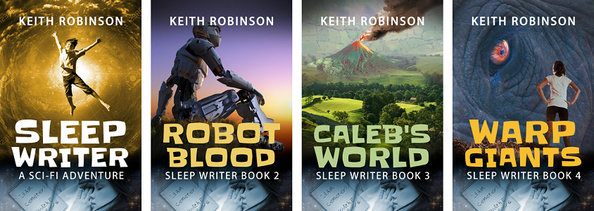
So what to do? I thought about altering the title. Currently, the three published books in this series are:
Sleep Writer (Book 1)
Robot Blood (Sleep Writer Book 2)
Caleb's World (Sleep Writer Book 3)
Since "Sleep Writer" doesn't jump out as sci-fi, what if I altered it? Here's a bad example to give you an idea:
Alien Wormholes (Sleep Writer Book 1)
Robot Blood (Sleep Writer Book 2)
Caleb's World (Sleep Writer Book 3)
See? It immediately clues readers in.
I can change the ebook title without a problem. Amazon, Nook, Apple, and Kobo allow such things. But print editions are another matter. Typically, the title is locked to a specific ISBN. I can't change the title without starting over, which means there'd be an out-of-print title knocking about forever in addition to the new title. I don't want that.
So I'm stuck with the title as it is. Okay, so I just need to change the cover art, right? Make it more sci-fi? How about something like this mockup, with a different font to appeal to younger readers?
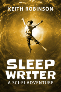
I like the idea of depicting Liam being sucked into a wormhole, a pivotal scene in the book, but now the title "Sleep Writer" doesn't fit the picture. So I thought I'd try adding Madison, the sleep writer herself:
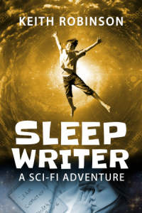
I think this works. Do you? Here's how it would look across all three published books along with the fourth due next year:
Okay, so at this point I was fairly happy. I got an opinion from someone, and he liked it. Of course, I'd prefer a bunch of opinions just to be sure, hence this post.
Then I started wondering what it would look like with the main cover art and the sleep writer bit switched like this:
I kind of like the second one better, but I'm not sure. It seems a little better balanced. Thoughts? It's okay to say you hate it or make other suggestions. But my purpose is to appeal to sci-fi readers aged 9-12. Remember, anyone browsing Amazon for new books only gives a nanosecond to each thumbnail on the page, so it has to stand out.
So, an overall summary...
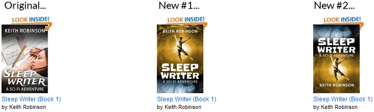
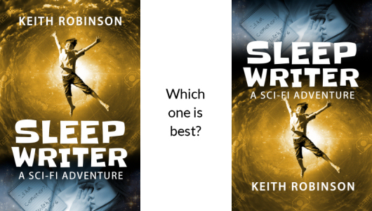
Opinions? Should I choose New #1 or New #2, or stay with the original, or try something completely different?
In general, I like the image where she's sleeping at the bottom of the picture better. Putting the 'sleeping' image at the bottom also implies the image above may be in someway connected to dreams or dreaming. I'll admit, I've not read the books, so I'm not sure how well that implications matches the actual stories.
I generally like Madison at the top of the book. However, I have an idea: what if you switched it up as you go, putting Madison in a different place for each Sleep Writer book but still keeping that pic of her, well, sleeping? Just a thought...
Another thing is that I'm not a big fan of your new, yellow Sleep Writer cover. I mean, it's alright, but it doesn't really go with the other book covers, in my not so humble opinion ;-)
Books 2-4 have solid, opaque pictures whereas the new book 1 cover is more hazy and translucent. Not saying that's necessarily a bad thing, but... TBH, the old cover of book 1 grabbed me more than the new. It felt more interesting, and less cheesy. But then again, that's just my opinion. If everybody else says the exact opposite of what I'm saying, go with them. They're probably right! ;-)
I kinda liked the original. I always thought of it as an adventure/coming of age rather than sci-fi.
However #1 is my choice. It just looks more balanced. The vortex is skyward. The sleeper is below. You could increase the font size for more drama. As the others have colored text, change the white to a blue. Kern the subtitle to align with title.
I like the idea of switching the cover, but I have to say I don't really like it when the characters are on the cover. It doesn't leave much room for me to imagine what they look like on my own. However, I love the new font.
I have to say I like the new #2 design best, just from looking at the pictures side by side it seems to stand out more. I dont have any issues with the colour or pic used either, to me it would still fit with the rest of the series. But to be fair, your original cover does state "sci-fi adventure" at the bottom which should also clue readers in. I understand that it is a wide and varied genre but it still points in the direction. I'm not aged between 9-12 but like most boys, I never really grew up either. Hope it helps.
Wow! See? It's hard to get it just right. Really useful feedback, thank you all so far!
Lyra, about characters on the cover... I totally understand that. I was reading about this "complaint" in book cover art not so long ago, and when I put myself in the shoes of a reader, I get it; I too prefer to imagine the characters for myself. And honestly, the girl on the front is not exactly how I imagine Madison.
Now I'm wondering if I shouldn't try to adapt the current cover — make it more colorful, change the font, perhaps mask her face in some way, add a starry effect around the corners?
Keep those thoughts coming in. I'm already seeing things differently thanks to what I've read here so far.
I just jumped on again to see others opnions. I've always said that there is too many varied opinions (everyone thinks differently) to be able to get it spot on and from the various comments it seems to be the case.
Hey Keith, I do like the new covers better than the original. I think, like you, the third is best. I just like the title on top better, plus it makes sense that Madison is behind the title.
You mention you can't change the title without affecting the ISBN. Can you add a subtitle? So instead of:
Alien Wormholes (Sleep Writer Book 1)
You get:
Sleep Writer (Book 1 - Alien Wormholes)
I'm doing something like this with the title of my new book. I like how you turned it around in the following books, but it seems to make sense that the first in the series is titled Sleep Writer.
Hey Ben, the entire title block is greyed out in CreateSpace, so no, I can't do anything with subtitles. Besides, the title is already "Sleep Writer (Book 1)" and is locked, so even if I could add a subtitle, it would be outside the parentheses, if you see what I mean. Like:
Sleep Writer (Book 1) (Alien Wormholes)
I've always included the parentheses and book number part within the actual title field even though a subtitle and series field are offered. I just don't use them. I find that searches work better when the title of the first book (which often becomes the series name) is included in the rest of the book titles. So:
Island of Fog (Book 1)
Labyrinth of Fire (Island of Fog, Book 2)
Mountain of Whispers (Island of Fog, Book 3)
etc
People searching on "island of fog" will then pick up the other titles without a problem. Amazon and other stores seem to have no trouble identifying the series from this setup and sorting them correctly even when the series field is unused.
And I think subtitles are really for nonfiction, eg:
How to Make Money: 100 Ways to Supplement your Income blah blah blah
Graeme, you're right — I really need 50 or more opinions to get a better sense of what works.
Looking at this from your perspective I'm not sure I'm seeing a wormhole! Maybe something more 'swirly' would make me think of a wormhole I think. From my point of view, both the new versions are too busy! Two images of Madison might be too much. As someone else said, the yellow colour isn't pleasing to the eye. However, either of the new versions are an improvement on the original when looking at the reasons for changing it. Hope this helps.
Andy, have you ever seen a wormhole? No? Well, I have. They're yellow and not swirly at all. LOL.
Point taken, though, especially about it being too busy. There's some yellowness in the book, but that's more to do with the cloud that comes down over the house. The wormholes themselves are like vertical pools of rippling water — you know, fairly traditional stuff.
I have to agree with Michael's opening comment: the first cover seems to make more sense to me. I almost unconsciously perceive the image of Liam to be a manifestation of Madison's dreams... although whether or not that is the correct interpretation is another thing entirely having also not yet read the book!
Either way, the new cover is definitely more YA friendly and the thumbnail 'pops' really well :)
Ha! Diarmuid, Liam is definitely not a manifestation of Madison's dreams. Now, the other way around, maybe...
But more to the point, why haven't you and Michael read it? It's FREE. :-)
I really like the 2nd book cover the best and I think that it looks very si-fi. I do like both covers though and either would be good. I hope that if you change the cover or not that more people will read your books because they are really good. Keep up the great work and I can't wait for your next blog.
Hmmm... I think I like the overall format of "New #1" the best. It plays well across the series and I get the idea that the sleeping figure at the bottom of the cover is "dreaming" about the different adventures above, almost like a subtle thought bubble.
Now you've got me thinking I should do something about my Viking fantasy cover. Not sure the lightning bolt's cutting it!
Samantha, do you mean New #2, or the second of the three covers in the last graphic? I'll assume New #2 for now. And Roger likes New #1... Talk about divided opinion!
A quick tally tells me there are 3 votes for New #1, 3 votes for New #2, and 1-2 votes for the original. I have a fourth vote for New #1 as well, but I still like New #2 better in terms of layout when looking at a thumbnail. BUT, I do like the suggestion that Madison is dreaming, in which case New #1 make sense. So is that 5-3 for New #1?
Based on two or more of you mentioning the same thing, it looks like the new font is a winner, but the color of the vortex might be too garish.
It's never too late to keep posting your opinions here, so please do even if this thread looks like it's going quiet. I'm off to work on it some more.
I have just asked my 14yr old son and he likes New #1 better. He says it's more interesting than the original, he also likes the font and his suggestion is to add some purple maybe?
I tend to prefer that one as well. To be honest, I wasn't sure if he would even want to read it when I saw a girl on the front cover; when he was younger, he didn't want to read books where girls were the main characters because they automatically became girl books. Girls however don't tend to mind so much, at least in my experience. So maybe the original cover wasn't the best, but as you know, he loves the series.
I also think that having the same picture at the bottom across all the books of the same series is a clever eye-catching idea that identify the books immediately and therefore saves searching time.
Great feedback, Arantza, thanks — and yeah, let's not forget to ask the opinion of younger readers, who are after all the target audience! :-)
I think the title one-third down from the top and the author's name at the bottom is better. It's the title I want to read first, and for a lot of browsers the author's name won't (yet) mean anything. And New #2 is definitely better than the original, which is a bit "girl's teenage diary".
Thanks Ralph — and everyone else.
As it happens, I was playing around with another idea. I took out the garish wormhole and thought I'd try a graveyard, since that's where the first book starts off. I also balanced the text so that the top and bottom have small lines of equally spaced print, and the main title is front and center. This way, I think the girl at the bottom is not quite so "tacked on." The text that reads "a sci-fi adventure" forms a sort of border that includes her rather than excludes her, which is what bothered me with the initial redesign.
Still playing, still welcoming ideas... :-)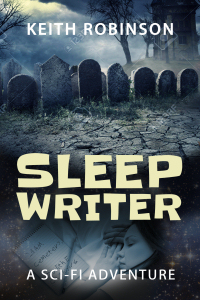
Whoah, that graveyard cover is a WHOLE lot better!!! :-) Better than everything else! Switch my vote, please. :-)
Haha! The thing is, somebody else said it looked like a horror novel. Everyone has a different opinion. I like the graveyard as well though, and it's definitely relevant to the story. Thanks for your vote!
Yup. The graveyard design is the best. Including a sci-fi element of some sort would help ground it in that genre as right now it does read "horror."
Thanks, The Roger. Actually, I have an idea about the sci-fi element that I need to work on...


