Book cover comparison
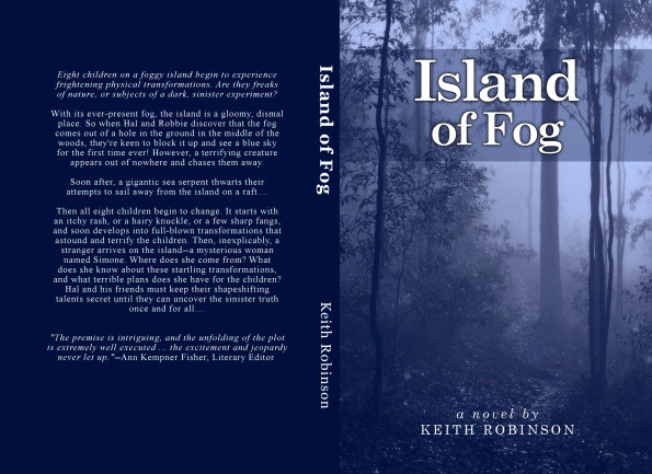
I've been waiting impatiently for the proof copy of Labyrinth of Fire to arrive, and finally it showed up today. It looks exactly as I expected it to look, and I'm very happy, especially when stood next to Island of Fog on my shelf! Fills me with warm fuzzies. :-)
Speaking of book cover comparisons, Island of Fog has been through two or three minor revisions since April, and we're talking very minor edits to fix a couple of typos and re-word a sentence or two. But the latest revision also included updates to the spine text and back cover, as you can see below.
Since Labyrinth of Fire follows through with the same layout, both books match perfectly... unless you have that first edition of Island of Fog. Most readers probably wouldn't care much about this sort of thing, but as a collector I like things to match (I'm funny like that). So, in the interest of matching book covers (and slightly updated text), would those who bought the first edition be interested in a replacement book at production cost only, shipped when you buy the second book? Contact me privately for details.
Here's the first edition...
Full cover -- Island of Fog (1st edition)
I wasn't happy with the centered text so I left-aligned it instead. Also I added Piers Anthony's blurb, a price, the genre, age classification, and a little picture! The spine text is capitalized too. Here's the latest version of Book 1 along with Book 2...
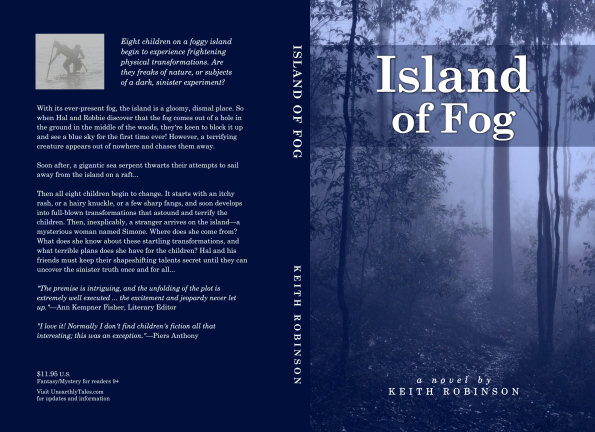
Full cover -- Island of Fog
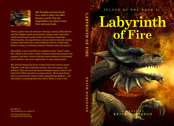
Full cover -- Labyrinth of Fire
There's a space below the text where I'll hopefully add some blurb saying "fantastic, wonderful, etc," before I launch. In any case, one thing I can promise is that this layout will carry through to Book 3 early next year!
My next job is to read Labyrinth of Fire (again) and mark corrections with a red pen. Meanwhile, I have two proofreaders working their way through. Assuming their suggestions are simple line-edits, I should be well on target to launch in early November.
Island of Fog Book I perhaps...
I love the back redesign. I think you should change the LoF back pic to match the style of IoF. It's looking like the first edition will be a future collectors item!!
Looking good, Keith! Shrewd move, by the way, to make some alterations to the cover. Should result in a few extra sales! ;-)
That's great, Keith! Looking forward to Labyrinth of Fire! :-)
Great covers, Keith. I love the fact that you have used contrasting colours for each cover.
What a striking cover, Keith. It looks good. Very tempting to pick up that book and read what's inside.
Show/hide all posts
- Box of Fables (Island of Fog Book 16) is finished! How would you like to read it earlier than everyone else?
- How to find the best keywords for Amazon (AMS) sponsored ads
- Next Chapter Con - A Books and Authors Convention
- The best laid plans of mice and men... and overworked writers who bite off more than they can chew
- Look out for at least 3 new books coming in 2019
- Book cover, title, and blurb - how did I get it so wrong?
- A cat named Frosty, a new book convention, and unicorns
- Fantasy and sci-fi cons and other author events
- Sci-fi episodic serial fiction - free for KU Kindle Unlimited readers
- How I'm going to publish 15 books in seven months
- Post a review for Island of Fog Box Set 1-3 and help make the next Box Set free!
- Doctor Who, anyone?
- Death Storm (Island of Fog Legacies #5) is published!
- A mild obsession with talking dragons in my fantasy books
- Middle-grade fantasy books with an Island of Fog theme
- Finding mythical monsters to put in my books
- Working hard to hardly work
- Island of Fog Box Sets now available... and FREE on Kindle Unlimited
- Get ready for a World of Fog
- Exactly how many times does an author edit and proofread a novel before publishing?
- New book hurtles toward publication
- Female fauns and other imponderables
- Save 20% on Island of Fog titles for a limited time
- A faun with a mist-erious power
- Think your book doesn't need proofreading? Think again!
- Results of BookBub promo for Sleep Writer (Book 1)
- Warp Giants (Sleep Writer Book 4) is published!
- A book is finished, and a new one starts!
- Con Nooga... and reactions to my book selling techniques
- Goodbye 2017, Hello 2018
- Tails of a Shapeshifter is published!
- Sleep Writer series has a brand new set of covers
- Constructing, websiting, and writing all at once
- Haunted Fortress (Island of Fog Legacies #4) is published!
- Completed book, forthcoming books, audiobooks, book sales, book covers, and... darkness!
- Book 4 of the Island of Fog Legacies just about finished
- Cover art, movie theaters, lazy writing, clunky first chapters, and being incredibly successful
- Novel proofreading service
- Gargoyle Scourge (Island of Fog Legacies #3) is published!
- Gargoyle Scourge available from bookstores on March 1st, 2017
- Island of Fog translated into Spanish!
- Gargoyle Scourge is ready for beta reading
- Happy holidays, massive downloads, foggy plans, black comedies, and daft ideas
- Gargoyles, a classroom in Australia, book reviews, and my kitchen floor
- Working on a new book cover for Sleep Writer
- When is it okay to give away major plot details?
- Latest book, website changes, marketing, and freebies!
- What's a self-published indie novel really worth?
- Sinister Roots (Island of Fog Legacies #2) is published!
- Sinister Roots launches in 9 days... and Unicorn Hunters is on sale!
- Plotting the next book
- Sinister Roots is finished!
- Back from vacation, and hardly a word written!
- Writer's block, stalling, and just plain old procrastination
- How do most readers find good new books to read?
- On the lookout for repeated words in manuscripts
- Free short story The Silver Wand (Part 4 of 4) now available
- Introducing the next book in the Island of Fog Legacies series
- Answers to a few niggles
- Unicorn Hunters (Island of Fog Legacies #1) is published and available everywhere!
- Free short story The Silver Wand (Part 3 of 4) now available
- Using a Chromebook for novel writing and editing
- Early reviews for Unicorn Hunters
- Pre-order Unicorn Hunters and get it on March 15th 2016
- Free short story The Silver Wand (Part 2 of 4) now available
- Unicorn Hunters first draft finished!
- Free short story The Silver Wand (Part 1 of 4) now available
- Sleep Writer series now available in paperback!
- New cover for new book in new Island of Fog series!
- Just over a million words
- Free short story Be Good for Belsnickel now available
- My name is Keith Robinson and I'm a writer
- Free short story The Soothsayer now available
- Mountain of Whispers Audiobook now available!
- Help make a book permafree... and then get it for free!
- Caleb's World (Sleep Writer Book 3) is published
- Another book just about ready to publish
- Free short story Trading Magic now available
- Free short story Unicorn Poachers now available
- Caleb's World undergoing final edits
- Free short story Robbie and the Ogres now available
- Monsters in the Fog is published!
- The second Island of Fog Chronicles book due for release on August 1st
- Free short story Riding the Serpent now available
- Robot Blood (Sleep Writer Book 2) is published
- Labyrinth of Fire Audiobook now available!
- Robot Blood is finished!
- Free short story Darcy the Dryad now available
- Robot Blood nearing completion and on schedule for June release
- Free short story Bird-Girl and the Shaggy Beast now available
- The price of Island of Fog novellas
- Free short story Night of the Centaur now available
- Free short story Nameless Monster is available today
- Island of Fog Audiobook published!
- Plans to continue the Island of Fog series
- Get a free cartoon of your child or other small person as a superhero monster!
- Eye of the Manticore and Wings of a Faerie are published!
- Countdown to February 15th
- Unearthed (Fractured Book 2) is published!
- Lots of fog planned for 2015
- Eye of the Manticore is finished and in final editing stage
- Island of Fog audiobook planned for release in the spring
- Island of Fog as an audiobook?
- A Very Merry Shapeshifting Christmas
- What's happening over Christmas and into the New Year
- Unearthed (Fractured Book 2) is ready for beta readers
- Island of Fog Chronicles coming in the New Year
- Island of Fog Omnibus Edition (Books 1-3)
- Fractured Book 2 is full steam ahead
- Sleep Writer (Book 1) is published!
- New series about to be launched
- Castle of Spells (Island of Fog, Book 9) is published!
- Possible reworking of Island of Fog
- Prison of Despair (Island of Fog, Book 8) is published!
- Castle of Spells on the horizon
- Prison of Despair beta readers!
- Last day of April
- Coming up in 2014
- The timeline in a long-running series
- What future Island of Fog tales would YOU like to see?
- My new writing regime
- Island of Fog Book 9: Castle of Spells
- Island of Fog Book 8: Prison of Despair
- Quincy's Curse is published!
- What's going on (and not)
- Valley of Monsters (Island of Fog, Book 7) is published!
- How to provide a reader with recaps of previous books in a series
- Valley of Monsters is now out to beta readers
- Are you interested in beta-reading Valley of Monsters?
- A series of Unearthly Tales starting in 2014
- Quincy's Curse out for beta reading
- FRACTURED is published and available!
- Progress on Valley of Monsters and beyond
- Books I'll be publishing in the next few months
- Island of Fog Book 7: Valley of Monsters
- Advertising and promoting an ebook with BookBub
- Sci-fi and fantasy novel Fractured is ready for beta reading
- Going perma-free on Amazon
- All books in the Island of Fog fantasy series now available at Amazon, Kobo, iBookstore, and Barnes & Noble
- Finding beta readers and proofreaders for your self-published indie novel
- Writing and editing a sci-fi/fantasy novel with another author
- Island of Fog is a B.R.A.G. Medallion Honoree
- Ned Firebreak by Brian Clopper
- The cost of shipping books internationally
- Chamber of Ghosts is published
- Island of Fog Book 7 - including prequel!
- Pre-order Chamber of Ghosts
- Movie adaptation of Island of Fog for release in 2015 (April Fool's)
- Island of Fog featured as Book of the Month
- Letters and artwork from a classroom in North Carolina
- Calling for Chamber of Ghosts beta readers
- Late edits to Chamber of Ghosts
- Website overhaul
- The ISLAND OF FOG fantasy series
- Collaborative novel writing
- Fractured - a free sci-fi and fantasy novel
- First draft of Chamber of Ghosts is finished
- Dragon book series
- Four FREE Kindle books for Christmas
- Piers Anthony reviews Roads of Madness
- Writing schedule
- How to design a book cover
- Island of Fog Book 6 - Chamber of Ghosts
- Free Kindle books for Halloween
- Island of Fog Book 6
- KDP Select aftermath
- In the works for 2012 and 2013
- Searching for young-adult and middle-grade fantasy books on Kindle
- Roads of Madness is available in print
- Does KDP Select work?
- Roads of Madness is available on Kindle
- Island of Fog is FREE for Kindle on August 29th-30th
- Brand new Island of Fog web page
- New book cover for Island of Fog
- Advanced reader copies of Roads of Madness nearly ready
- Flight of Blue
- Irving Wishbutton and the Questing Academy
- Get an advance copy of Roads of Madness
- Roads of Madness preview and launch date
- Ideas to reboot the Island of Fog series
- Price change for Kindle and Nook ebooks
- Letters and artwork from fifth-grade students
- Summer Reading Kick-off - winner of Island of Fog series
- The power of a printed book
- Author Keith Robinson's Fantasy Novels Make Front Page With Chickamauga Library Book Signing
- How NOT to promote your self-published novel
- Book signing at Chickamauga Library on April 10th
- Roads of Madness on Twitter and Facebook
- Do you like cliffhangers in novels?
- Island of Fog Book 5: Roads of Madness
- Brian Clopper: writer, teacher and foot soldier
- Quincy's Curse and Caleb's World
- What does 2012 have in store?
- On the subject of Santa Claus
- Lake of Spirits review by Piers Anthony
- Stop typing for a second, please!
- Where did Miss Simone come from?
- Are prologues necessary?
- Lake of Spirits now available in print
- Dragon*Con 2011
- Lake of Spirits available on Kindle and Nook
- Third Writers' Platform-Building Campaign
- Lake of Spirits proofreading and editing is finished!
- Reviews and featured spots for Island of Fog series
- Why I write a chapter summary for the next book
- What blog posts do you like and dislike?
- Creepy and not great for impressionable children
- Lake of Spirits is being proofread
- Thinking about Island of Fog: Book 5
- On the search for a literary agent
- How many self-published books sold to date
- Lake of Spirits first draft is FINISHED!
- The second trilogy
- Progress in the lake
- The benefits of self-publishing and ebooks
- Millions of books sold at Barnes & Noble
- Book signing at Barnes & Noble, Chattanooga, TN
- Letters from Jones Dairy Elementary School Part II
- The science of fantasy creatures
- The phoenix arises
- Island of Fog Book IV: Lake of Spirits
- The Impossible World
- Preparing for the storm
- A new year and a new novel
- Question Time: Part 2
- NaNoWriMo 2010 Winner
- Publisher says no
- NaNoWriMo update
- NaNoWriMo 2010
- Books Never-Ending
- On the shelf at Barnes & Noble
- School blog
- Question Time: Part 1
- Dragon*Con in Atlanta, Georgia
- On TV again... or was I?
- Author copyright
- Busy day at the office
- Mountain of Whispers is PUBLISHED!
- Mountain of Whispers is FINISHED!
- Minichapters
- Mountain of Whispers final book cover!
- Mountain of Whispers cover update
- Books can be ordered at Barnes & Noble
- You can't rush a genius...
- Look, I can't help being British
- Cherokee Regional Summer Reading Kickoff 2010
- Readability test
- Review by Publishers Weekly
- Mountain of Whispers first draft completed
- Farewell to ABNA
- Naga mythology... and Medusa
- Abigail doesn't sing!
- ABNA expert reviewers
- The ABNA quarterfinalist results are in!
- Writer's Digest International Self-Published Book Awards
- Letters from Jones Dairy Elementary School
- ABNA first round winning pitch
- A third of the way through Mountain of Whispers
- New shipping rates
- Manticores
- ABNA pitch
- Piers Anthony and Amazon Breakthrough Novel Award
- Book Talk at Rossville Library
- Quality control at CreateSpace
- Mountain of Whispers
- Book III: The plot thickens
- Expanded Distribution at CreateSpace
- Self-publishing
- Book delivery... and new book trailer
- Replacement order, watery events, and ideas for book title
- Box of books missing... or lost?
- Book Nook in Dalton
- Book review winner... and Happy Thanksgiving!
- Book signings and events galore
- Labyrinth of Fire available for pre-order
- Grammar, and other pointless trivia
- Library visit, events, agents, editing, and reviews!
- Teen Read Week at Chickamauga Library
- Georgia Literary Festival 2009
- Book cover comparison
- New dragonized book cover
- Win a copy of Labyrinth of Fire by reviewing Island of Fog
- 104,227
- Final chapters of Labyrinth of Fire
- Lava tubes and dragons
- Male harpies
- Impromptu talk and book signing at Rossville Middle School
- Three library book talks finished
- Treatments and manuscripts
- Ray Atkins book talk and signing
- The Bookshelf interview on UCTV-3
- TV and film agent for Island of Fog
- TV interview and appearances
- Island of Fog now on Kindle
- Tweeting and writing
- Gumberoos and squonks
- Labyrinth of Fire
- First public speaking
- Thumbs up from Piers Anthony
- Down Home Days
- First delivery of books
- Island of Fog now published and available to buy!
- PDF download now available
- Proof book has arrived
- Island of Fog is published!
- Final, final, FINAL edit
- The manuscript is back!
- Sending Island of Fog to an editor
- Self-Publishing vs. Traditional Publishing
- Writing, writing, writing
- Feeling an urge to write


